Pulse
Keep your finger on the pulse of production.
Pulse puts every line on one live screen: what is running, what is down, what each job is on track to finish, and who was clocked on while it ran. It watches the thresholds you care about and tells the right people the moment production slips, without anyone refreshing a dashboard.
Plant OEE right now
64%
Try Pulse yourself, no setup
Staged data in a live build. First load takes 30 to 60 seconds.
What it does
Everything you need for manufacturing excellence.
Pulse reads every connected Vorne board and virtual station, puts them on one screen, and pushes what matters out to the people who need it. Complete tools and insights to turn operations into a data-driven powerhouse.
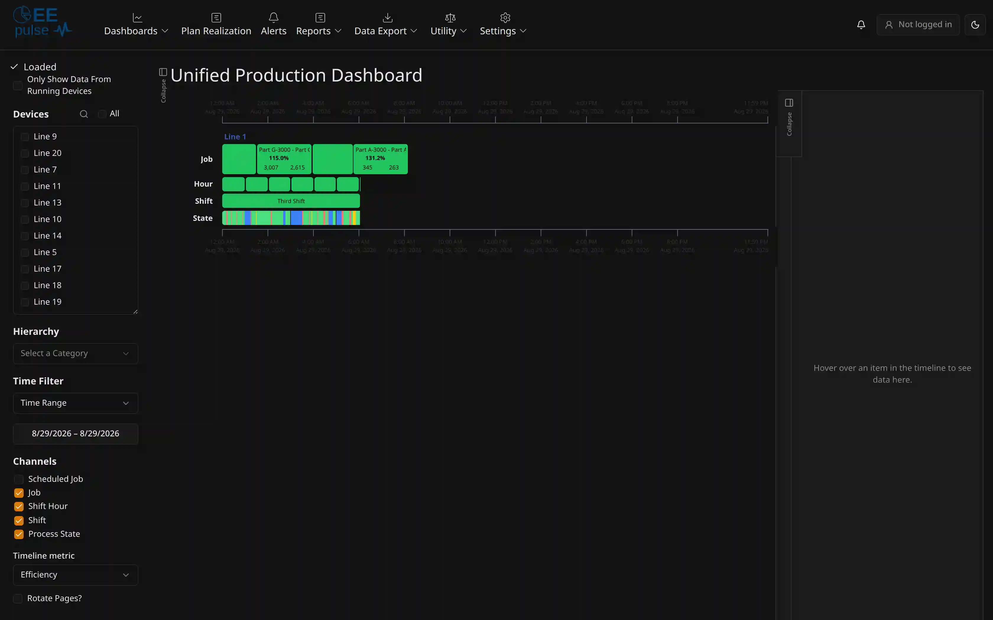
Unified production dashboard
- Unified view of all boards
- Employee Punch Timeline dashboard
- End of job prediction
- TV-ready display rotation
Real-time alerts
- Customizable notifications
- Board-offline alerts for active V2 Vorne boards
- Threshold-based alerts
- Use state and reason codes
Custom integrations
- ERP system connectivity
- Email, SMS, and push alerts
- Teams, Slack, and Discord
- Show weather, customer, SO, and BOM data
Data integrations
- SQL Server
- Postgres
- Oracle DB
- MySQL
Mobile access
- iOS
- Android
- Windows
- Tablets
Works inside your firewall
- Your production data never leaves your network, secure by design
Smart alerts
Notifications that reach people off the floor.
Intelligent notifications that help maintain optimal performance and save costly downtime. Set the rule once, and Pulse watches it on every shift.
Master downtime alerts
Set thresholds for downtime events and receive instant email notifications when limits are exceeded.
Custom category filters
Create alerts by plant, location, or type and track metrics like OEE, Availability, Quality, and Performance.
Process and state event alerts
Stay informed of critical production events with alerts triggered by specific state events and reason codes.
Board-offline alerts
Know when an active V2 Vorne board stops reporting, with a configurable timer and automatic recovery when it reports again.
On screen
Powerful dashboards at your fingertips.
A unified interface for analyzing production data across every device, built to sit on a plant TV as comfortably as on a phone.
Filter by device hierarchy
Quickly drill into areas, lines, and machines to focus on what matters.
View and manage comments
Track notes, feedback, and issues directly from operators and supervisors.
Scheduled jobs and run-to-schedule
Pulls jobs directly from your ERP and shows if each line is ahead or behind in the production timeline.
Rolling time windows
Pick the last 12 hours, 24 hours, or 7 days and keep the range rolling, so a screen left up all shift follows the clock instead of going stale.
Raw data
Take the numbers with you.
Data Export is a menu of its own in Pulse. Pick a dataset, pick the columns, filter it down to the devices, jobs, and window you care about, then take it away as CSV, Excel, or PDF. It is an export rather than a canned download: the file is the question you asked on screen, not a fixed report somebody else designed.
Four datasets
Metrics is the production record by shift, job, and hour. Rejects is every reject with its reason and count. Job Punches is who was clocked on and when. Instants is the raw snapshot rows, straight off the board at board cadence, and high-volume enough that it opens with a row cap already set.
Your columns, in your order
Every dataset opens on a sensible set of columns. Add more from the picker and they stack up on a shelf in the order the file will use. Two checkboxes bring in the hidden Vorne fields and the hidden IntelliSuite IDs when you need to reconcile against the source, and leave them out of the way when you do not.
Filter first, export second
The same device, hierarchy, and time filters as the dashboards, plus the ones that belong to the dataset you picked: shift, shift hour, job, part, team, state, reason, reject reason, employee. Search across every column, and set the row limit yourself.
CSV, Excel, or PDF
CSV for a script, Excel for analysis, PDF for someone who just wants to read it. Pulse warns you before it builds a PDF that will be too long to read, and when one has too many columns to sit on a page it says so and recommends Excel.
You rarely start from a blank export. Right-click an event on the dashboard, or use Drill in on the event's detail panel, and Data Export opens on that event's device and time window already, in whichever of the four datasets you picked. The reports work both ways too: each has its own Export button for the report as it stands, and an Advanced export link that carries the same filters over to the raw rows underneath it.
Who was on the line
The machine's story, with the people in it.
Work Tracker collects the punches and Pulse draws them against the machine's own timeline. When someone asks why Tuesday afternoon went the way it did, the answer already has names on it.
Employee Punch Timeline
A dashboard of its own. Every punch is drawn under that machine's job, shift, and process state rows, so you can see who was clocked on while it ran and who was there while it was down. It stands on punches, not jobs, so it still tells you something on a line that does not run job numbers.
Names on the tooltip
Hover a job, a state, a shift, or a shift hour on the dashboards and the tooltip lists who was punched on for it, grouped into primary, secondary, maintenance, and other.
Built for real shifts
Two people on the same role at once get their own lanes instead of hiding each other, and a punch nobody has closed runs to right now rather than vanishing.
Reading the day
Where the hours actually went.
Downtime is the easy part to see. Pulse also breaks out the cycles that ran slow, keeps one impossible reading from wrecking the chart, and walks total time down to the OEE number you are being asked about.
Slow cycles, called out
The Day at a Glance cycles chart breaks the time into run cycles, small stops, partial cycles, and slow cycles: the ones that finished but took too long. Where a board has not classified them yet they show as unclassified, so the time is still on the chart.
Spikes stop flattening the chart
Clamp Rate Outliers is on by default and clamps rate outliers at the 99th percentile, so a single impossible cycle time cannot squash a whole day into a flat line. Switch it off when you want the raw numbers.
OEE Waterfall
A report that walks total time down to OEE one loss at a time: not scheduled, planned stops, availability, speed, then rejects, with your own downtime reasons named on the way down.
Walkthrough
Watch Pulse run a shift.
A short tour of the live dashboards, the production timeline, and the alerts that fire from them.
New and next
AI-powered manufacturing intelligence.
Tools that predict issues, optimize performance, and take the digging out of production questions. Each one carries its own status.
Smart alerting
Get proactive notifications when performance slips, before downtime hits.
Job packet integration
Gain instant access to real-time job metrics, BOM, and labor details in one place for complete production visibility.
AI chat assistant
Ask questions about your production data and get instant answers, no digging required.
Resources
Learn more about Pulse
User Guide
A walkthrough of Pulse's live timelines, comments, reports, and alerts, with live screenshots in light and dark.
Read the guide →Interactive Brochure
The full Pulse overview: features, benefits, and where it fits in the suite.
View brochure → (opens in a new tab)Printable PDF
The same brochure, opened straight into your print dialog to save as a PDF.
Print to PDF → (opens in a new tab)See your whole plant on one screen.
Book a demo and we will connect Pulse to a line like yours, set an alert, and show you what the floor looks like from the office.